Platform Vision &
Introduction:
How do you measure the success of creating a product experience that aligns with an organisation’s values? How do you guarantee consistency throughout product ‘experiences’ when they are being created by a large team that are scattered in different locations? These are just a couple of the problems I tackled with my Head of Design, Phil Walters, while leading the team at MYOB. This case study is going to take you on the journey of forming our Platform Vision and Experience Level Objectives. It highlights key learnings and the benefits this process can bring to any design team.
Speaking at Enterprise UX Meetup about “How to develop a strategy vision platform experience.”
A little Background
If you are unfamiliar with MYOB, put very simply, they are a technology company who produce accounting and business management tools for SMEs and accounting firms. What started out over 20 years ago as an out–of–the–box software product purchased at OfficeWorks, is now a modernised, subscription-based cloud service.
Not everyone grows up dreaming about designing accounting software. That said, one of my main motivators was that if we are doing our job well, we can save users A LOT OF TIME, money and frustration. Roughly speaking there are 60,000 accountants using this product. If we can take a 10–minute task that accountants perform every day and reduce that to five minutes, that is over 500 hours saved in just one day!!!
The journey begins with research…
To start our journey, we engaged with external researches to identify how people felt about the brand and why people chose one accounting product over another. The research pointed to MYOB needing to move away from features delivery and shift to thinking about how to differentiate on experience.
24% of customers cite user friendliness as the main reason for choosing a competitor only 17% who cited product features.
Research found that“Efficiency” and “Ease of Use” are the top two key purchasing criteria for Accounting Software.
A company can turn out features, and competitors can then appropriate them; however, it’s difficult to holistically recreate a platform’s experience. How it functions and looks – and most importantly how users feel when using the product. These are aspects not easily replicated. This presented the question: what values and vision do we want our strategy to be built around.
A path forward:
We knew we wanted our product vision and experience to align with the MYOB brand. The product is the touch point that clients most often interact with. The branding team recently laid the groundwork of what MYOB represents: Authentic, In the Know and Inspired. We spent time talking to people and discovering how we could reflect that in the product. This is what we came up with:
Authentic: The branding team described ‘Authentic’ as accountability; knowing the customers so well that everything MYOB does and every decision made is to help their businesses succeed. It shines through in honesty, empathy, and the way MYOB personally connects with customers. We incorporated this into the product to reflect:
- Delivering a Fast, Secure and Reliable Experience. Every. Single. Time.
- Experiences are Consistent and Familiar – there are no surprises.
In the Know: The branding team described ‘In the Know’ experiences as knowing the customer so well that MYOB deliver intelligent and connected tools, combined with valuable insights that provide the right answers at the right time. We incorporated this into the product to reflect:
- Remember who they are and what they’ve told us.
- Are there with their information and Insights when they need it.
- Automatically Adapt the experience based on behaviour and needs.
Inspired: The branding team described ‘Inspired’ as ‘Ah-ha’ moments. Knowing the customer so well that moments are created that motivate and delight. Challenging the status quo and stimulating thoughts. We incorporated this into the product to reflect:
We evolved this in product to reflect:
- Aim to make experiences 99% Invisible, all the work behind the scenes.
- 1% you do see is Inspired, the experience is amazing.
The diagram below clearly shows how our design principals relate back to the brand values.

At the end of this process, through the application of these Design Principles to our design and development processes, resulted in a vision for the platform. From this Platform Vision, we started considering a framework to enable people to design and develop to these standards, which took us on the journey of building the Experience Level Objectives (XLOs).
MYOB Design Heuristics:
To kick off the XLOs, a heuristic evaluation chart was created. This audited each workflow against 14 questions that aligned with our grounding principals from the Platform Vision: consistency, efficiency, finely crafted, flexibility and helpful. Each item would be scored on a 0-5 scale on how it lived up to that value, with 0 being the worst-case scenario and 5 the best. A question that scored a 5 should contain delighters that go above and beyond.
Below, in column two, is the list of the heuristic evaluations. Column one shows the principle to which the questions align. The third column is a practical example.

In Excel, the 14 questions are averaged to create an overall XLO score of either Bronze, Silver, Gold or Purple (MYOB’s signature colour).
Not shippable: <45% Bronze: >= 45% AND no score less than 1 Silver: >= 65% AND no score less than 2 Gold: >= 80% AND no score less than 3 Purple: >= 95% AND no score less than 4
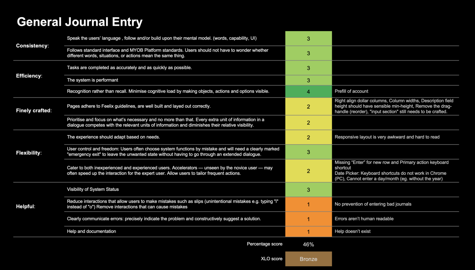
Here is an example of how the scoring looked across one workflow for “As an accountant, I need to do a General Journal Entry for a business client.” In this case, the XLO score was a Bronze.

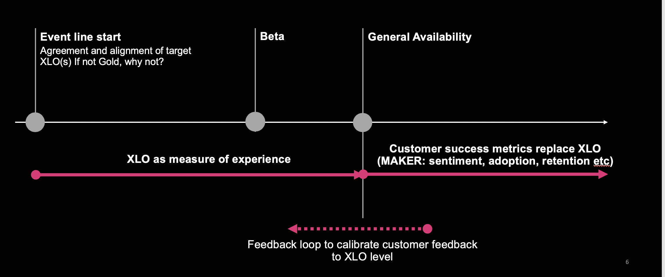
Design and Product Management agreed that the XLO score would be the measure that determines which experiences were the appropriate quality for release. As you can see below, Bronze XLO was the minimum for a closed BETA and a Silver XLO for general availability. The aim was to generate 3 Purple experiences for the product every 3-6 months.
After asking the same questions repeatedly across 30 workflows, it quickly became apparent where the product experience had gaping holes. For example, Helpful > Help and Documentation: every workflow ranked a 1-3 due to a lack of onboarding, tooltips or help resource. We quickly created a business case for investing in improvements for this particular area, and as a result it raised the XLO scores across the platform. The XLO framework allowed key decision-makers to easily see where they could get more bang for their buck in terms of design and development time.

Customarily, the Product Manager and I were responsible for the scoring. Keeping the same Design Manager (myself) scoring across the workflows enabled us to keep the scoring consistent. If it was the designer who directly created the experience, they may be biased; and it would in turn be judged too harshly or loosely.
Another added benefit was having a holistic view of the whole product. Typically, the Product Manager would attempt to score a principle higher than my own perspective of it. A great example of this the question, “Follows standard interface and MYOB Platform standards. Users should not have to wonder whether different words, situations, or actions mean the same thing.” I would have the opportunity to point out aspects that were not following the Design System or raise issues regarding experiences that differed elsewhere in the product. It gave us the opportunity to backlog the improvements and as a result uplift the score and user experience.

As it was such a big investment of our time to score each workflow, we began to add comments to elaborate or justify our scoring. This helped enormously with the backlogging of improvements, as well as making it easier for other stakeholders reviewing the spreadsheet.
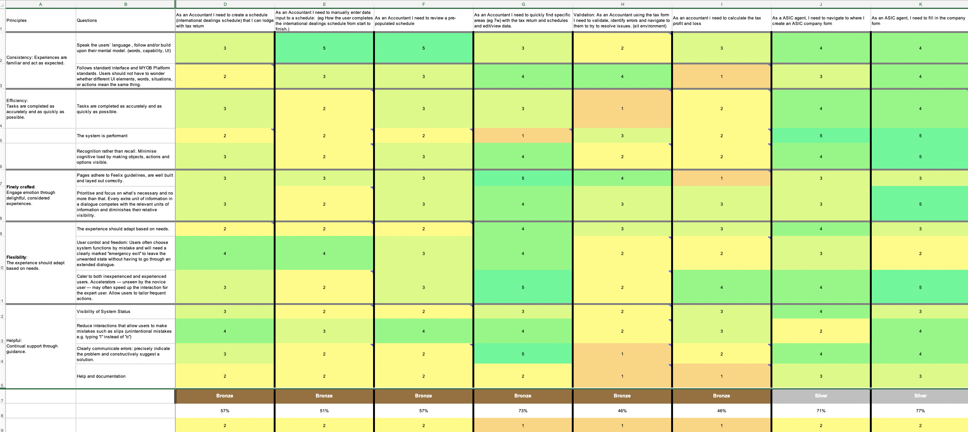
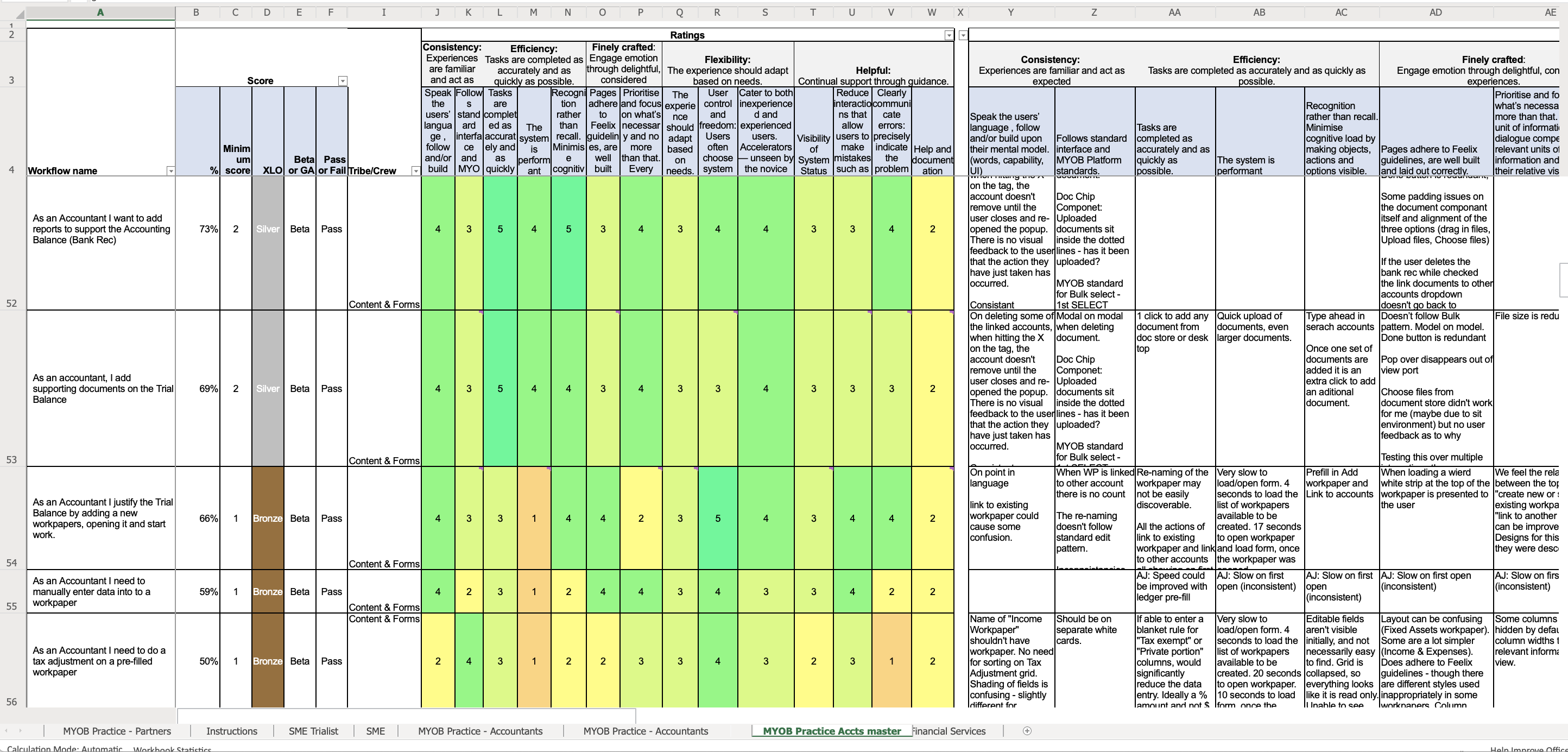
It’s important to always iterate on design even when using Excel. Below shows the final Excel sheet that we created to document the XLOs. Having the workflow and XLO score on the vertical axis and the questions asked on the horizontal axis made each workflow easier to review, whilst being able read the details without scrolling and losing context.


Problems XLOs Solved:
Speaking the same language: This framework positioned the team to speak the same language and align on the work. In kickoff meetings, Designers, BA, PM and Developers would discuss the XLO they aspired to achieve and why. The design principle would assist in navigating these tricky conversations before any work commenced. The XLO allowed us to define what ‘DONE’ looks like.
Framing the investment: XLOs assist in framing the investment in terms of time, quality and analysis during the discovery, design and development phases. For example, a setup task which a user does once and never revisits we might be ok setting the benchmark as a Silver XLO Experience. A task an Accountant does 20 times a day we might agree is a Purple XLO and the designer might be able to justify building something new outside our design system.
The framework allowed me to articulate why a designer shouldn’t be spending three weeks on a Silver XLO. Designers started to understand it wasn’t because we didn’t care its was because we wanted to invest the time elsewhere. As a result, teams and individuals become more satisfied with their work, no longer thinking corners were being cut.
Forward thinking: We started anticipating aspects that might deteriorate the XLO early and mitigated the risk. Business Analysis and Developers would foresee details like load times during the design stage as opposed to testing. Designers could then better contemplate these considerations in terms of the user’s experience. We were able to plan for iterative implementation in terms of how we propose to move a feature from Silver > Gold > Purple.
Lifting the benchmark: Our overall organisation lifted the benchmark on the quality of the experience and had more visibility. We no longer shipped workflows that didn’t meet MYOB standards. We moved away from just looking at the successes of individual features and focused on holistic experiences.
Final Thoughts:
A Product Vision is a valuable resource to help align an organisation, and the XLOs are an amazing tool to facilitate accountability in the consistency across a platform. This isn’t a ‘quick fix’ or something that can be rolled out overnight. The evolution of that framework was a journey that took 6 months and had many sceptics along the way. I had to evangelize it in many different forums and get thought–leaders within the cross–functional team to help advocate belief in it. The journey was worth the pain in terms of the value within creating uniformity of experience and uplifting and aligning with brand values.
If you have alternative ways your own organisation is achieving and measuring consistency I’d love to hear and learn from you.
