
Content:
MYOB, a technology leader who produce and supply accounting software, identified a key opportunity to move the existing desktop software into the cloud. As the Product Design Manager my responsibility was to lead the product vision for the new, innovative cloud version, ensuring all current moving parts fit together and functioned correctly. My goal while at MYOB was to move the benchmark forward, to create a consistent world class experience, driven by the end users’ voice (i.e. research). Prior to me joining the team there was very little data driven design happening. This case study will focus on the journey of developing the platform’s information architecture (IA). I managed the Sydney design team for an approximate five years. This was one of my first initiatives.
View the finding of the UX work I presented to the Engineering and Product Management teams via a Google stream across our Australia and New Zealand offices. Password: Myob1234
The Problem
While I was trying to articulate the vision for MYOB’s platform, I fell down the rabbit hole of designing it’s IA and redesigning the navigational components. For those of you who are unfamiliar with IA, it’s the practice of understanding the user, content and context, and how to structure that information. IA focuses on organising, structuring, and labeling content, so that users can easily find the information and complete tasks. My aim was to make the complex; clear, navigable, and understandable.
As a result of multiple conversations with the MYOB teams, I identified that key stakeholders lacked an understanding of IA and the importance of investing time into such a significant structure. In order to gain support for this project to commence, I had to dedicate time advocating and educating on how and why it would make a huge contribution towards improving the platform’s experiences, usability and scalability.
Proving the problem was worth looking at: With a lack of ‘buy in’ (i.e. budget) I did a lean audit of the MYOB desktop software to understand how users felt about its usefulness with their day to day tasks. After 5 open-ended, qualitative interviews, I was able to present back to stakeholders that there was a lack of standardised naming conventions, consistency on where to locate key features, as well as lack of connectivity for how tools integrated. By presenting this important research back to stakeholders, I was able to secure buy in from the Head of Product to invest more time into not replicating these same mistakes within the new cloud-based product, which could cost MYOB exponentially.
The project’s end goal was to create three hypothetical models of the online information architecture one, three and five years out.
The Process
To move forward with the IA project, I wanted to dive deeper into some of MYOB’s 50,000 Practice Software users’ mindsets, to build empathy for their daily tasks, workflows and challenges. I did this by conducting a range of both qualitative and quantitative research methods ensuring I included all role types, practice sizes and geographic locations across Australia and New Zealand. By the end of this project I had engaged with over 220 end users and as well as a range of internal subject matter experts.
Here is the process I followed (I’ll explain each of the below in more detail):
- Lean Canvas
- Competitor Analysis
- User Interviews
- User Survey
- Stakeholder Workshop
- Open & Closed Card Sorting
- User Workshop
- Let’s take a closer look at each stage of this project.
Lean Canvas:
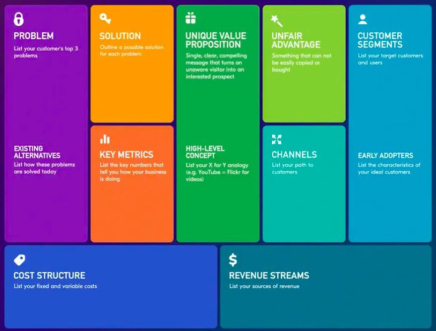
Lean Canvas is a planning method that helps to get to the heart of your idea or problem you are solving. It puts everyone on one page, helping to set out the key information needed. It provides a snapshot of the supporting information and questions to be answered.
I find it helpful to fill in the Lean Canvas as a cross-functional team to ensure everybody is aligned. In this scenario, as I was trying to solve a global problem and due to a lack of Project Managers (PMs) buy-in, I filled in the canvas and circulated via email. Here is a Lean Canvas checklist you might find helpful for creating your own. It allows PMs the opportunity to contribute while avoiding a situation where all PMs are in one room agreeing that they think it isn’t the most important thing to be working on (right now).
Competitor Analysis:
The next step of the project is examining the IAs and navigational systems of MYOB competitors to see if there are any learnings we could utilise. I discovered that the competition has complex navigational systems, with a lack of contextual awareness. One product even required a user to login several times to access different modules. What a nightmare for the user! This audit showed me that MYOB had an opportunity to differentiate in the market with a simplified, easy to use IA and navigation. No one was doing this particularly well. Download more details of the Audit

Some of our competitors visual looked more appealing but still had a poor navigation structure.
At the end of this process, through the application of these Design Principles to our design and development processes, resulted in a vision for the platform. From this Platform Vision, we started considering a framework to enable people to design and develop to these standards, which took us on the journey of building the Experience Level Objectives (XLOs).
User Interviews:
Becoming more comfortable with accounting principles and jargon, I was confident in conducting user interviews myself. I created a user interview guide around the goals of the Lean Canvas. I collaborated with PMs and Business Analysis (BAs), who are accountants, to write a guide. I also vetted the script with other Designers to ensure the questions were not leading. I conducted 12 interviews over the space of two weeks, aiming to keep each interview within an hour time slot. I found many accountants had never been asked for their feedback before and really enjoyed talking, so some interviews lasted two hours. Yikes! My brain hurt after those two weeks, and I learned more about accounting than I could have ever imagined!
A team may be working on one client, but need the ability to quickly and easily view other client’s information – (Aimee, Accountant)
I get so frustrated with how much clicks it takes to get to specific information. It should just be easy. – (Carol, Practice Admin)
Two of the quotes from the interviews. Read full list of quotes
Synthesizing the data: With the permission of the participant, I would record the session. When conducting interviews without a note-taker, it’s challenging to capture the conversation and stay engaged. Recordings allowed me to thoroughly capture each user quote and synthesise the data after the interview. I’d spend time typing out each interview, transposing key quotes or observations onto Post-It notes, using one colour for each person. Next, I affinity mapped all clues captured (user quotes) into groupings. The groupings then became themes which I would write a few ‘hunches’ for. The hunches then became insights.

Below are the key insights from the interviews after final analysis;
- Users need to identify workflows, activities, and information quickly with minimum clicks
- Users need the ability to easily switch between as many as 8-20 screens
- Users day to day work makes them engage with list views (lists of clients) as well as view a specific client simultaneously
- When working users want flexibility in their approach to finding a tax client. (e.g. some start at the tax module while others go directly to the client list)
- Most users do not have a “Typical Day” using the software.
User Survey:
After presenting insights from the user interviews, I received comments from PMs like “You are not talking to the right types of users” and “That’s not how our clients work”. In my experience, I discovered that not all stakeholders listen to the same types of data. Some people believe numbers, others prefer direct quotes and others are not convinced until you have several data points all aligning in the same direction. To mitigate the risk of the project getting parked, I wanted to obtain some quantitative data to see if it pointed in the same direction. I created a survey asking questions around the day to day work of an accounting practice. I was thrilled that we got 114 responses. Whilst writing this survey, I learned a lot of ‘best practice’ strategies around effective questioning. If you want to read more on my learnings whilst creating a user survey click here.
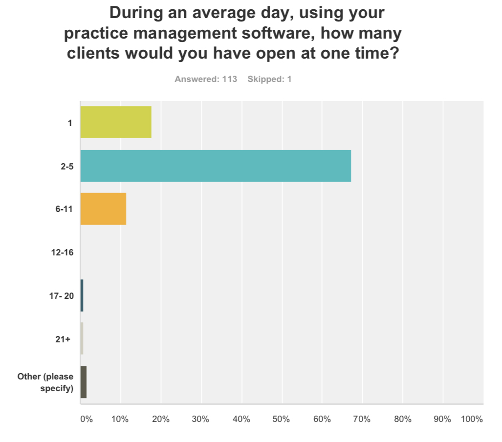
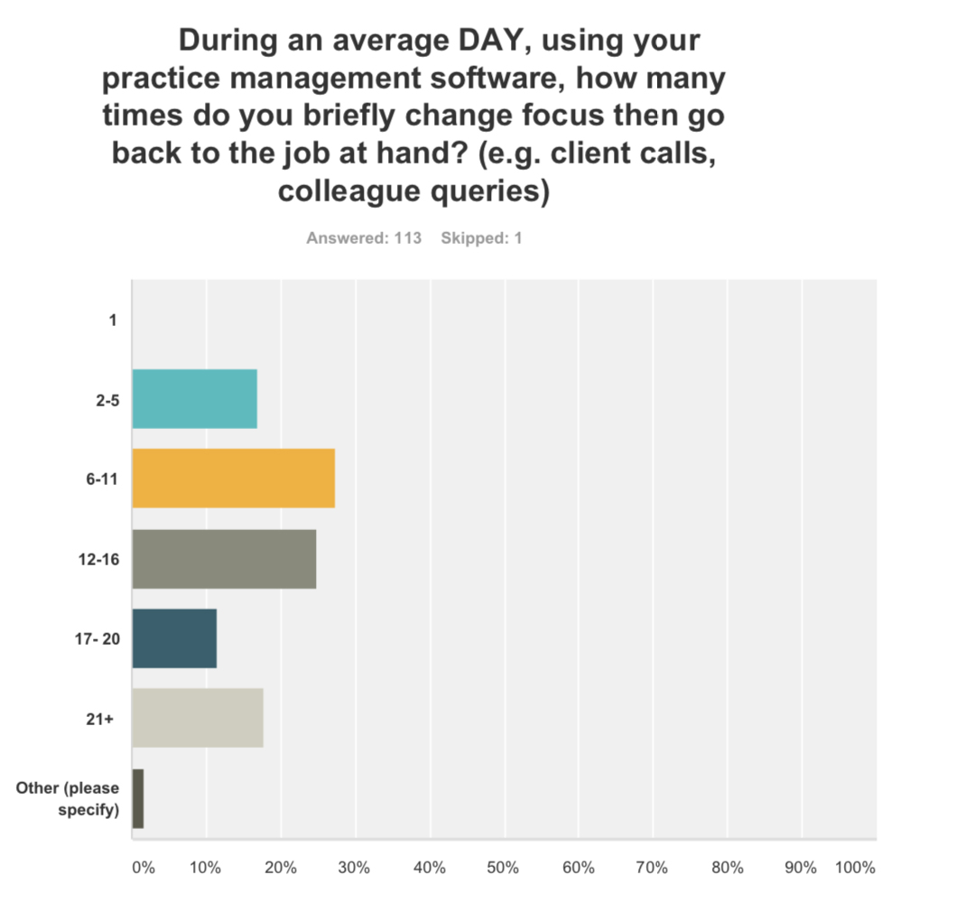
The ‘Ah-ha’ moment: The problem the IA and navigation needed to solve was giving the user the ability to easily multi-task. They needed to be able to briefly change focus or look something up and then go back to what they were doing, without spending a lot of time to regain context. This is not something I had heard any PM talk about. PMs would describe the tax return process in the “ideal scenario” from start to finish, never mentioning that 66% of accountants would get interrupted 2-5 times an hour and 20% 6-11 times.
Stakeholder Workshop:
To move the project forward, I wanted to conduct some card-sort activities, which would help me understand what the structure of the platform would look like (i.e. where pages would reside). To do that I needed to document all of the current pages and tools, which is not an easy task for a product that has been around for over 20 years. I needed to leverage internal knowledge.
I invited primary PMs who worked cross-platform to a workshop. Each PM had their own Post-It colour and were asked to note down all pages and tools for the module they managed. Once everybody had finished, we placed them on a white board. Next, I presented the insight from the previous research stages and the need to give users the ability to multi-task and work across different modules easier. I then asked the PMs to collaborate to envision what the cloud coffering could look like.
My agenda (on the side) was to utilise insights gained from the workshop to physically document each area of the product. An added bonus was getting more stakeholder engagement helping them to develop a better understanding of the importance of IA.
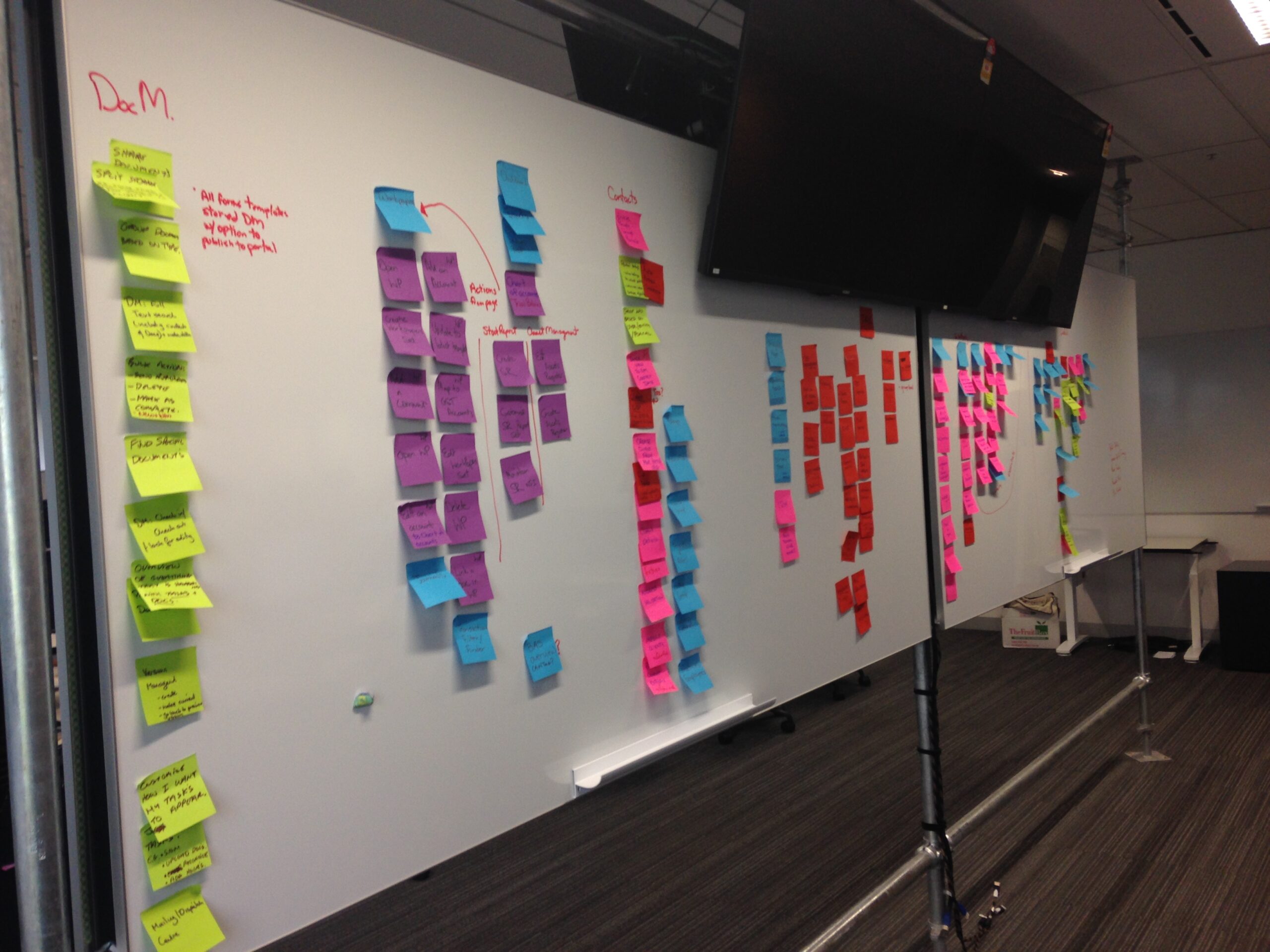

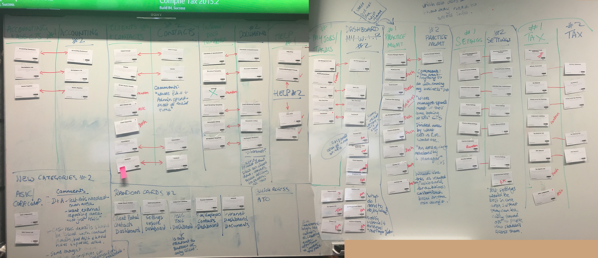
Left photo: Shows the group card sort Right photo: A screenshot of some of the 110 pages we documented
Open and Closed Card Sorting
For those of you unfamiliar with what a card sort is, it’s a method in which participants group individual labels written on notecards according to criteria that make sense to them. In an open card sort, they will name the grouping. In a closed card sort the labels will be given to them. This method uncovers how the target audience’s domain knowledge is structured, and it serves to create an information architecture that matches user expectations.
From the 110 areas documented in the stakeholder workshop, I condensed them into 50 of the most actively used areas, which we know are in the roadmap for development in the next 1-5 years. 110 cards would take hours for users to organize, and I feared there was a risk of users getting fatigued.
Overall, we conducted 30 card sorts, learning each time. I started with 5 ‘in-person’ open card sorts to ensure the activity was straight forward and made sense, before engaging 20 users in an online closed card sort. I learned from the first 5 that I actually needed to carry out two separate exercises. Accountants view the software in two different mindsets; an “All View” consistent of lists of tasks or clients and an “Individual Client View”.

The images above are from a range of different research activities, including the analytics from Optimal Sort. .
This reflected the data produced during the user interviews, allowing me to connect the dots and pivot the activity quickly. However, it’s worth noting that, at this point in time, having two views was not something commonly discussed when designing MYOB products.
- Round 1: 5 in person open card sorts
- Round 2: 15 open card sorts online (30 in total, the same person did one for each view)
- Round 3: 14 online closed card sorts (28 in total, the same person did one for each view)
- User workshop to validate the findings
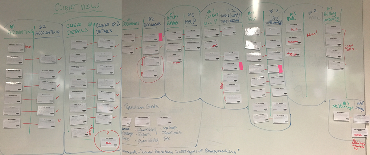
Here you can see how I analyzed round 2 and 3 against each other for both views. The majority of the data validated, and those that didn’t gave us an idea of where more discovery was needed. The top images is the list/all view, and the bottom image is for the client-centric view.
User Workshop:
After several iterations of the open and closed card sort, we asked 12 participants from various roles and company sizes to come into our office for a user workshop. The goal of the workshop was to dive deeper into areas we had questions about as a result of previous card sorting stages. I decided the best way to achieve this was a workshop that paired two people with similar roles, and listen to their conversation, as they completed a card sort with an MYOB Designer prompting them with questions on areas we wanted to improve. The workshop was 4 hours which also included them creating a journey map of where they feel the biggest pain points and areas of opportunity are. Read Full Case Study
Output
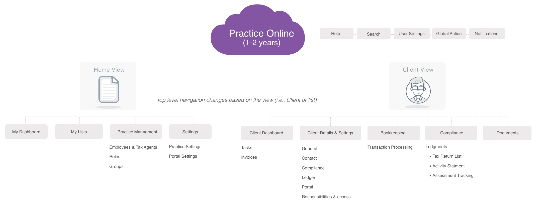
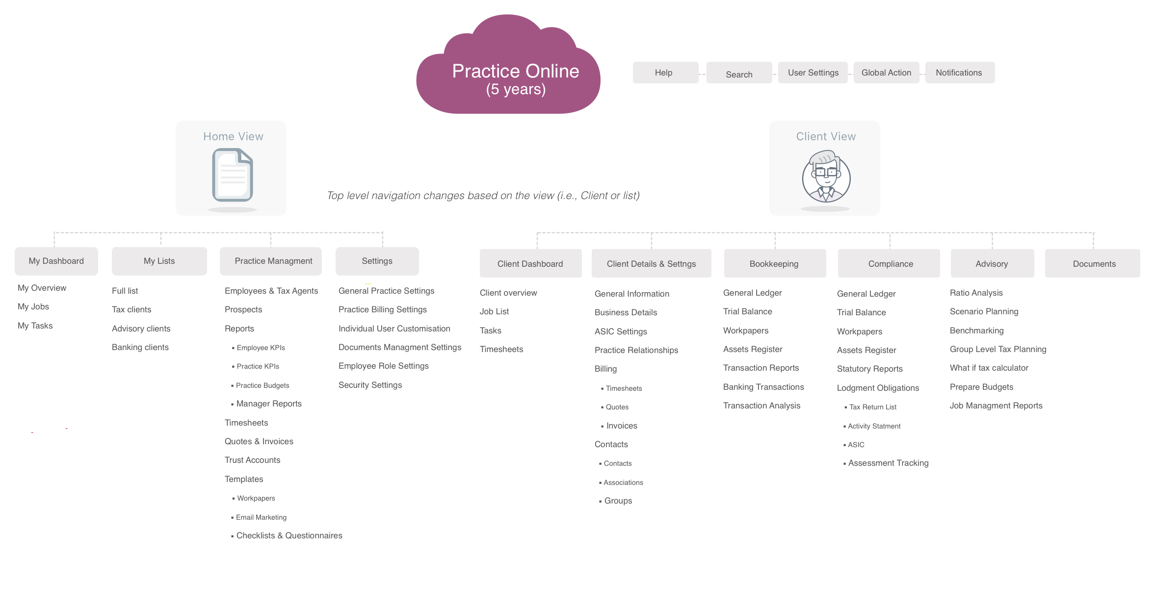
Below you can see the IA structure based on the above stages of research. Conscious that this was going to take a significant amount of time to ‘build out’ all relevant features, I needed to break this up into a staged approach, supplying a 1-2 year view and a 5 year view. I think it’s really important to note the IA is a living growing part of a platform. It’s not a project with a start and a finish. It should be revisited frequently to ensure it’s still relevant with a user’s mental model, whilst ensuring that a PM can’t come along and decide to make their product feature a main navigation item, without a data driven explanation.
Key Learning:
- If you don’t have buy in for global projects they can quite easily fizzle out and lose momentum. Don’t forget the importance of sharing your findings throughout the process. Fortunately, I was able to utilise MYOB’s lunch brown bag sessions to share knowledge with the wider company. This created an internal buzz around IA which helped shift stakeholder mindsets, as well as earned the Design Team more credibility and respect.
- You don’t always know how big or small a project is going to be before you start. Sometimes small research investments may ultimately lead to bigger ones.
- Having multiple data points leading in the same direction can create a powerful story that gets buy in.
- Leverage internal knowledge, especially in a space you are new to. Being new to MYOB, I was able to move a lot faster by using domain experts to sanity proof the user interview guide or diving deeper into a subject matter I was not yet familiar with.
- Don’t underestimate the importance of terminology. Misusing one word can have a significant influence on the actual meaning, and therefore relevance of research and data. Prior to sending the survey out I had worded most questions “While using your software”. After vetting the survey past 3 accountants they pointed out that they use a lot of software and I should say “Accounting Practice Software”. Quite often you will have a limited amount of time or resources for conducting research, so it is important to get it right the first time.
- Information architecture work is never done. The nature of Agile product development is that we are always learning and adding to our platform. So naturally, the product needs to be periodically reviewed to ensure standards are being followed and the structure is still relevant to users.