
End of Year Compliance
Context:
Accountants prepare client accounts to calculate the profit/loss and taxable position at the end of the financial year (EOFY). Portions of data needs to be disclosed to various Government bodies in differing formats to ensure clients remain compliant.
As the Design Leader that guided the product, I lead the team on the migration of relocating the EOFY Company Tax Return from desktop software to an online version. We had the opportunity to re-imagine a dated and manual process, leveraging the key advantages of a digital platform.
During the event line, my team designed and developed what I would describe as micro-workflows and tools. We needed these micro-workflows to harmonise, establishing the preponderant goal of lodging the EOFY tax return for a company. Each micro–workflow my team forged followed our human centered design process; including research and testing, with orchestrated stages of iteration.
Towards the end of the event line, our hypothesis was that we had ample tools and workflow developed, as well as an additional value proposition, that users would be enticed to migrate to the online experience. However, as it had not been tested end to end in working software, we determined that this risk required closed BETA testing.
Before moving to a closed BETA, our goal was to observe accountants using the combined tools in order to evaluate if the new offering is sufficient to entice users to move away from the traditional desktop process. This exercise would allow us to discover areas for improvement, ‘delighters’, as well as provide an indication of how to prioritise future work.

Above is the journey of the of the EOFY company tax return; you can see each stage and collaboration points. This process can take weeks or months, depending on the size of the business.
The Experiment:
We extended an invite to five accountants to attend our experiment, where we constructed a makeshift Accounting Practice. We recruited participants who fit the description of our target BETA user, an early adaptor. Each accountant used their personal work laptop, and we provided monitors to replicate a typical/usual desk setup.
As participants would be hesitant to share real client data and information, we fabricated a client named Steve and supplied them with the business financial data needed to complete the task. On the day we asked each accountant to complete the task of:
“Prepare the accounts for an Earthworks business for the
financial year ending 30th June 2018, for their client Steve.”
To make participants comfortable as possible, we encouraged them to take coffee breaks, answer phone calls and respond to emails as they would in the office.
Observing:
To gather as much information as possible, we asked participants to talk out loud while working and an observer sat next to the participant recording what they did, how they did it and any questions they may ask.
Prior to the workshop key areas were identified that we wanted to observe more vigilantly:
- We introduced a new value proposition that was the use of prefill data. In the existing system, accountants had to enter in the same figures many times over. The new workflow pulled financial data from relevant locations into the workpaper and tax return. As accountants are notorious for not trusting math, we were curious if they would trust the prefilled figures, whilst observing how much time it would save them.
- If a user understood the flow of data and where the data was being pulled from.
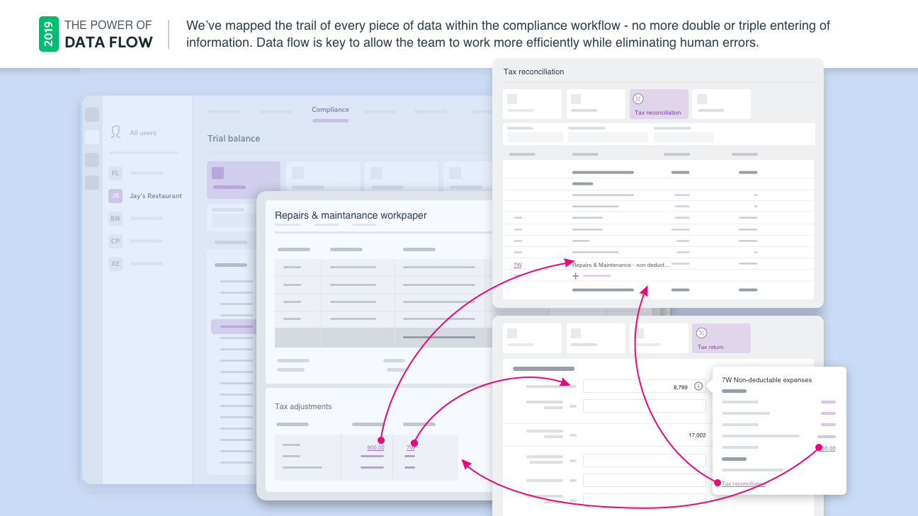
This screen shows the value proposition of the data prefilling throughout the workflow. Users previously had to enter in the same figures many times over.
- We created an innovative new tool which allowed accountants to launch auxiliary work, for example their schedules and work papers in a new window, allowing them to multitask. We wanted to study this in a real-world scenario and how they used different monitors to support multiple screens.

This screen shows the visualisation of supporting documents opening in new screens, an area we wanted to pay extra attention to our user interacted and navigated between screens.
- We had previously held a design sprint in which we simplified the main navigation. Our aim was to establish if the new designs were conducive with the end to end workflow. Did the user always have context of where they were at within the software.
- Within several stages of the workflow, a draw component offered the user supporting information. We wanted to observe how they interacted with the draw and if they understood the connection to the primary content.
- Did the platform offer enough workpaper templates to complete a company return?
- Have we missed anything major?
Collecting the data:
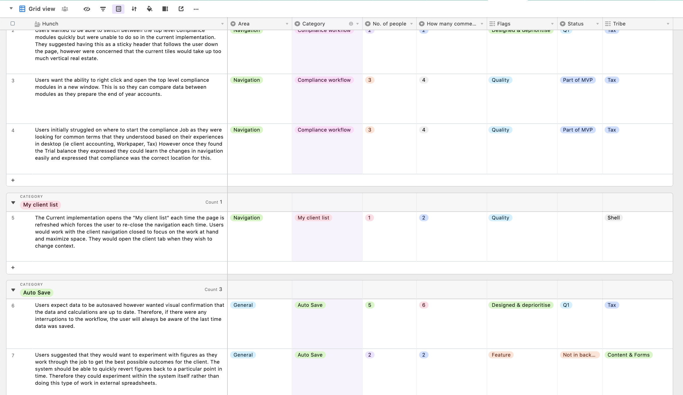
Prior to the workshop, we created an Airtable template for each designer to enter their observations into on the fly. To help speed up the coding process, and from previous learning experience, we anticipated the need to code by “Product area”.
Product Areas:
- Workpaper content
- Trial balance content
- Company tax return
- Tax reconciliation
- Journals
- Assets
- Ledger
During breaks and at the end of the day we ensured all observations were comprehensible, coded and any relevant notes were added. I strongly suggest when undertaking an activity like this that all notes are ‘tidied up’ before the end of the day, while information is still fresh and everyone is in the midst of the experiment.
Airtable is a powerful tool and one I would suggest using for this type of observation work, as it allows you to filter and easily organise the information, while allowing for sharing data with remote teams.

Above is show a screenshot from Airtable, the tool used to capture the user observations.
Synthesizing the data:
Capturing 6 hours of information from 5 participants resulted in a lot of qualitative data to synthesise. We accomplished this through affinity mapping all clues captured and grouping these into themes to provide clear hunches and insights from each stage of the process.

We found it helps to synthesise data by writing every clue on a Post-It note, keeping the same color for each participant. After writing each clue and becoming familiar with the content we started or organise them by Product Area. We were quickly overwhelmed with data and found secondary themes emerged around usability. Remarkably, we identified consistencies across all areas of the product.
- Automation
- Data linking
- Understandability
- Navigation
- Usability
- Status
- Review / re-work
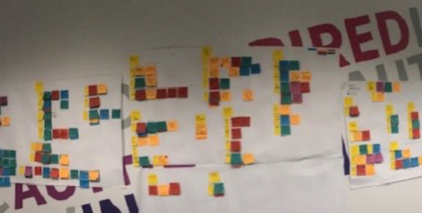
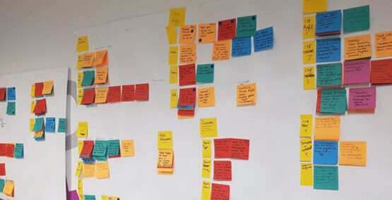
The image above shows the result of the infinity mapping the 425 observations.
From the hunches we noted insights that we would then present back to the team to discuss next steps. We included how many people and how many clues formulated the insight, to help stakeholders understand the weight of each point. Doing this allowed us to share the detailed information with the cross–functional teams. I personally find nothing more satisfying then when someone questions your research insight and you can find the exact user quotes that informed your thinking.
The outcome of the workshop resulted in:
425 Observations/Clues and 90 Insights
We presented back to stakeholder:
As above, we ascertained that there were primary areas that needed to be addressed, and we presented it take to stakeholders in the categories below, as it wasn’t going to be possible in a short hour window to review 90 insights.
Quality: Performance, Prefill & Automation, Consistency & Bugs
Content: Content Missing or Not Needed, Terminology, Context
Usability: Navigation
Surprises: Things that we weren’t expecting
Positives: Things we can celebrate

Final thoughts:
- Don’t go to BETA without a real-world test: This workshop gave the opportunity to find and fix some showstopper bugs before launching. You only get one chance to make a first impression.
- Prepare, prepare, prepare: Accountants value their time to the tune of $125/hour. The workshop needed to be as pain free and seamless as possible so participants felt their time was respected. Having the room setup ready to go and anticipating questions or challenges that may arise will make your team look more professional and the participants time more appreciated. We also found it useful to have a runner on hand who could quickly help liase technical issues with the development team, meaning that we didn’t have to interrupt observations.
- Limit the number of people coming and going: AA large team contributed to this workflow (150+), so naturally many people wanted to pop their head in and see how it was going. It was very distracting for the participants and observation team to endure these disturbances.
- Use observers who have experience in user research: Before kicking off a session like this, I always tell the participants “If you ask me a questions, I’ll most likely ask you some questions back to understand the question deeper. I’m not trying to be difficult. I just don’t want to lead you.” This can be uncomfortable but necessary. A couple of the less experienced observers would quickly volunteer a solution answer which may bias the participants.
- Code on the fly: I have run and participated in several workshops, and it’s always easier to record notes directly after. Allocate a couple of hours for this task to make sure it’s completed before the end of the day.
- Analysis: The analysis took 3x the amount of time as the workshop itself. It helps to keep the analysis group small, in this case two people. We carried out our analysis in a communal work space close to other people in the office, so they could see and begin to understand how we work. It was great when people would pop over, ask questions and get excited to learn about the outcomes. The artifact (wall of Post-It notes) hung in the office for a few months after the event.
- Sharing knowledge: Senior stakeholders were utilising this information to determine if the product could move forward to a closed BETA, whereas the cross–functional teams were just as keen to see the efforts of their hard work!