Refining the Craft
Introduction:
Open, constructive design feedback is essential for creating a consistent experience across a platform. Sharing unfinished work is uncomfortable and it can generate tension, however it is a vital part of the design delivery process. Over the last six years leading the team at MYOB, I‘ve continually evolved how to approach design critiques to allow for maximum feedback and a shared knowledge, within the minimum timeframe. As a Design Leader, my goal was for designers to leave the meeting feeling empowered and unblocked, to validate while creating a consistent user–focused platform.
I’d love to share with you some of the aspects my team evolved over time in regard to how we approached our critiques, as well as how our work matured throughout that process, in the hope that you might just get a little inspiration for your own critique
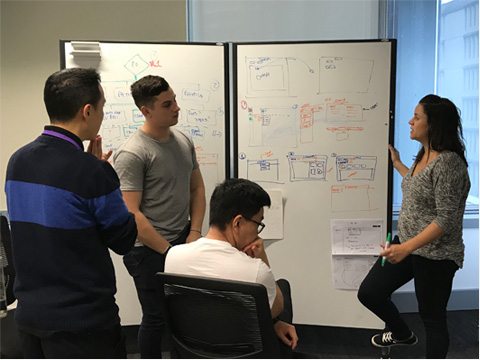
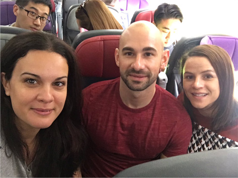
Initially, there was a lot of ambiguity in terms of the structure, frequency and agenda. Sometimes they were whiteboard sessions other times showing designs on a flight to Melbourne. We found a lot of value out of adding more structure.
Create A Framework for The Critique:
Collaborating to create clear guidelines of what is expected during the critique process made the team much more productive; and the designers left the critique feeling more satisfied. Prior to creating a framework, there was a lot of inconsistency in how each person presented. As the team’s leader, I felt it was important that they work together to create their own governance, so that it felt less like rules and more like a manifesto. These are some of the things that worked well for us:
Having a facilitator: Each session had a dedicated facilitator (meaning it wasn’t always me as their manager). The facilitator’s role was to ensure conversations were keep on point, within the allotted time, and that the presenter left acquiring the feedback they needed. They would recap the takeaways and the next steps to ensure everyone was very clear on the outcome. I found that rotating the facilitator role gave more junior-level designers an opportunity to develop their leadership experience in a low–risk setting.
Have an ongoing roster: I created a set day and time every week for us to meet and we agreed on a rough agenda that must be contributed to prior to the meeting. This information helped keep the meeting organised and on point, documenting the takeaways. The agenda included:
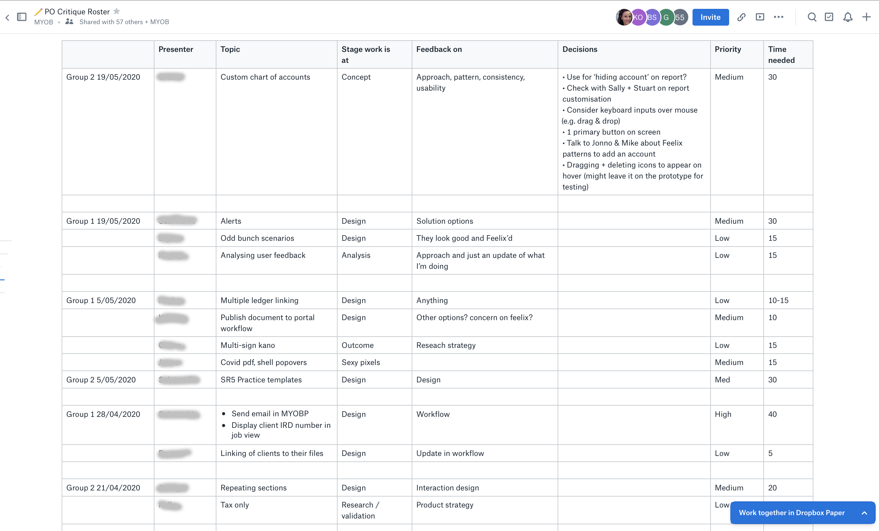
Roster to include:
- General topic matter
- The stage the work is at
- What the designer is specifically seeking feedback on
- Key decisions as a result of the critique
- Priority or urgency of the feedback needed
- Time needed to present
Maximum three presenters: An iteration we made along the journey is limiting the amount of people who presented each week to three designers. Prior to this change, some weeks we had eight designers wanting to share in a one-and-a-half-hour time slot. They struggled to give context and get feedback with only 10–mintues each. We adhere quite strictly to the three–presenter rule, but allowances were sometimes made based on the urgency of the work. We tried to make this the exception, not the norm. It meant designers had to be responsible for getting their name into the roster at the earliest point possible, not leaving it until too late in the week, driving them to be more accountable.
No devices: We discovered that we had picked up some bad behaviors along the way; some of us would be on Slack or replying to emails instead of giving our full attention to the ideas and concepts being shared. Everyone made a commitment to putting down their devices!
Critique Doesn’t Always Mean Interaction Feedback:
I encourage everyone on my team to present every few weeks, taking the group on the journey as their project evolves. This helps the group build their domain knowledge over multiple sessions and weeks, instead of in one big bang, where often we would have more questions than suggestions.
For example, at the start of a project the designer will review a Lean Canvas they constructed and the team are given the chance to soundboard other areas for opportunities and integration. Or the team might point out risks that they have learned themselves while working on similar types of projects. The critique could discuss other research methods that might be helpful to solve the task at hand or reading over survey questions to evaluate if there are any biases. We are really open to all types of problems being addressed during the critique, not just interaction design.
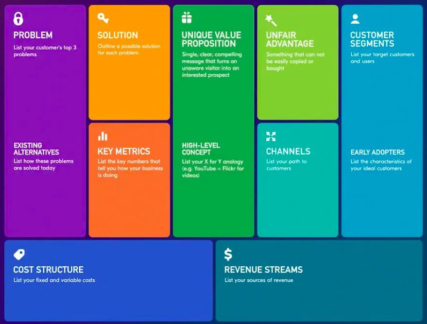
This is an example of Lean Canvas.
Research-Led Discussions:
When I first joined MYOB, critiques would often leave designers feeling frustrated and deflated. Designers would debate the merits of their personal preference instead of having discussions based on data–informed insights. Once we converted to, “I tested this with 10 users” or “I’ve completed an environmental scan and found these approaches were used the most”, then everyone became more comfortable giving relevant feedback. The critiques became much more productive and designers were more prepared to answer questions. I started hearing things like, “I originally assumed that as well, but testing proved different” or “The CSAT score was higher on this workflow.”
Be Specific on What You Want Feedback On :
With projects having lots of complex moving parts it’s easy to be overwhelmed when looking at a screen and wanting to give feedback on every pixel, but that isn’t necessarily useful to the person presenting. Before each person presents, they would set the context on the specific feedback they wanted and didn’t want. It could be micro and/or macro. Sometimes it might be the wording on a button or the trigger for a dropdown. Other times it might be zooming out and looking at a whole workflow. Knowing what the presenter is trying to achieve in their session helps the group to stay focused.
Create Rituals:
My teams fluctuated in size and in geographic locations over the six years. At one point over the holidays, we had people dialing in from four different countries. Leading people and creating a culture within remote teams can be tricky. I find it always helps when teammates know each other on a personal level. To develop this, we would start out most meetings with a little ice breaker on the highlight and the lowlight of our week. Often, people would say very humorous things that made the critique feel lighthearted and fun. It would connect us. We also had a squishy purple dinosaur that we passed around each month to somebody we deemed as having gone above and beyond – they also got a coffee on me. Often, being recognised by your peers is as important as your being recognised by your manager.
Keep the Design System Front of Mind:
A major focus of our critique was evaluating interaction design and how components or patterns from our design system are used. Sometimes new things would sneak their way into our designs, so we would then discuss how to simplify the design using existing components and patterns. If, through user testing, existing components or patterns proved unsuitable, then the designer would talk through a business case as to why the effort to develop a new component – or create a variation on an existing component – was justified
Here is our process, in a nutshell, for creating a new component.

Illustration by Mike Trilford
Below are some examples of how designs evolved over time.
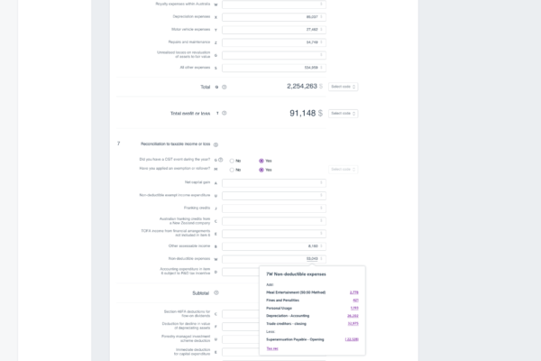
Side Draw: There are different variations of the navigation. In the critique a designer mentioned that he was working on the navigation for a long tax form, and user insight showed that the nav was best positioned in a side panel. From there, the designers worked together to design the component and ensure it worked across the platform, creating a consistent experience. Outside of the critique, several team members worked to define the guidelines around the new component and would bring those details back to the team for their feedback.

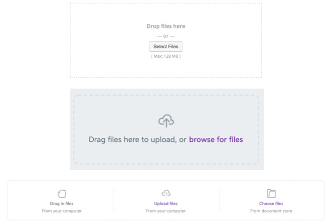
Files upload iteration: The current component relied on a connection to MYOB Document Manager as default. But if a workflow doesn’t necessarily need to use Document Manager to store data, then this component becomes unsuitable. As a result, an extension on this component was added to allow the CSV file to be used to import the data, without the need of the CSV file itself being saved back to Document Manager.
In a previous version of the component, a user only had the ability to get data into the document storage through a ‘drag–and–drop‘ action as well as by browsing files. However, this afforded no ability for the user to retrieve something that had already been uploaded. Therefore, an extension on this component was to give the user the ability to select from existing files. This could be used in workflows where the user wanted to attach/refer back to previously uploaded documents without having to re-upload it each time.
To Sum it Up:
Every team has its own dynamic and culture, so it’s vital to work with your designers to forge guidelines that make sense of any idiosyncrasies and that play to your team’s strength. Be agile in your approach to critique, and take the time to retro to uncover new ideas to make critique its most productive.

